RampUp
Mobile App Development Case Study
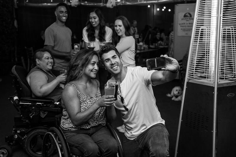
Designed to let wheelchair users and caregivers discover authentically accessible places near them
Roles: Project Manager, UX Researcher, UI Designer, Usability Tester
Timeline
3-week Group Project
Key Skills
User Interviews, User Stories, Data Synthesis, Sketching, Information Architecture, Workflows, Wireframing, Interface Design
Tools
Google Forms, Miro, Descript, Figma, and lots of coffee.
Context
According to the CDC, 61 million adults in the United States live with a disability. Of the people with disabilities, 13.7 percent have a mobility disability with serious difficulty walking or climbing stairs. That's about 8.4 million people in the U.S. who use wheelchairs or mobility aids.
For many of these individuals, accessibility in different environments is a daily challenge that has a profound impact on the way they navigate their daily lives.
Overview
Problem
People on wheelchairs experience accessibility issues when trying to navigate a public place. Often, they have to call a place of interest ahead to ensure that their accessibility needs are accommodated, i.e. parking spaces, doorways, ramps, seating.
The need to plan ahead with lack of information causes stress, arguments, and tension for wheelchair users.
On the other hand, businesses who do not list their accessibility information are missing out on revenue because of the lack of visibility upon research.
Goal
How might we make business information (like restaurants, museums, etc) about accessibility accommodation easier to find for people who use wheelchairs?
Solution
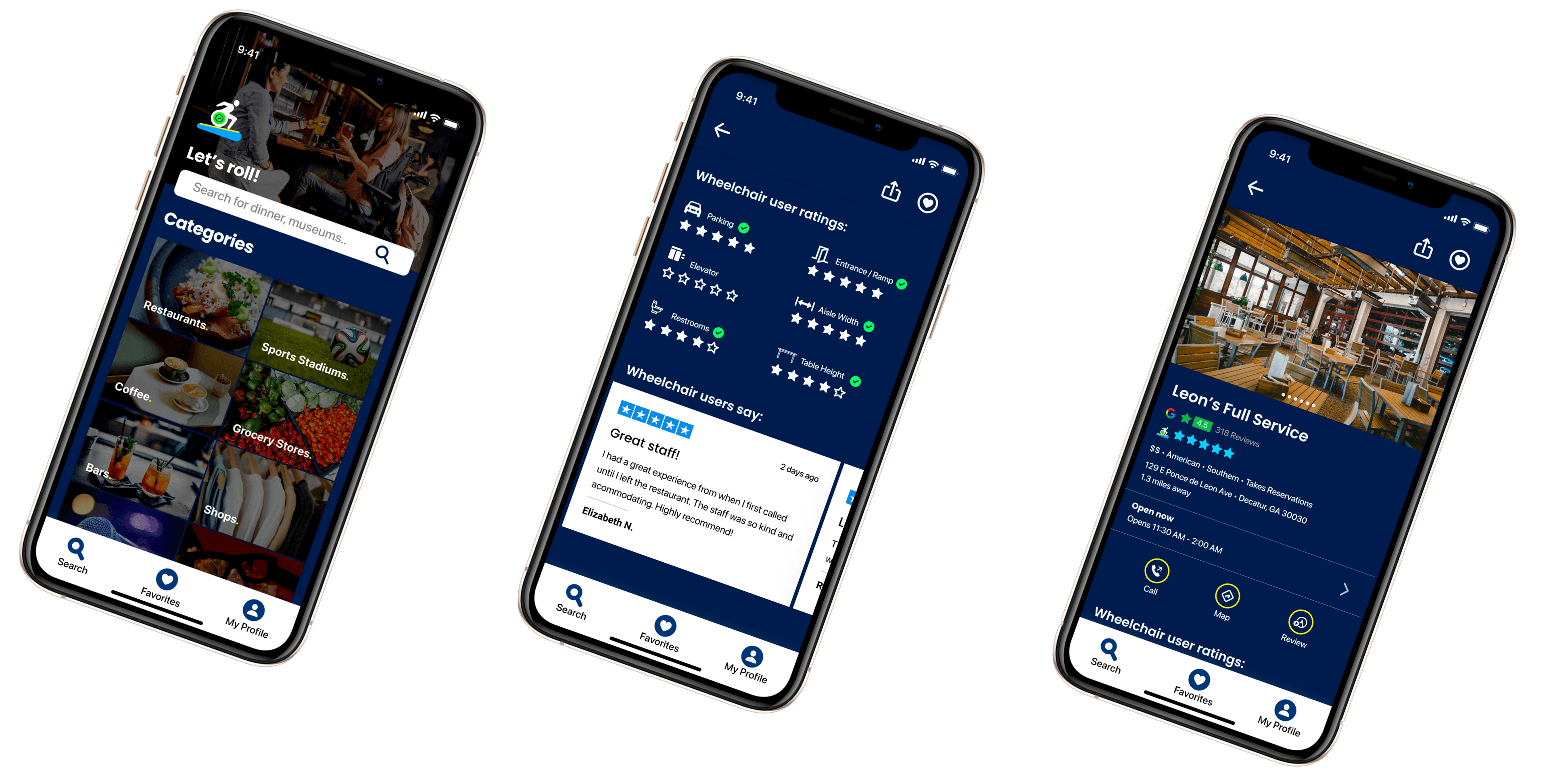
RampUp is a mobile app that allows wheelchair users and caregivers discover, rate, and review authentically accessible places near them.
Results
User-Centered Design Process
User Research
Ideation
User Flows
Prototyping
Usability Testing + Iteration
Phase 1: Research Goals + Proto Persona
Hypothesis
We believe that a mobile app that provides information about accessibility features of public spaces (restaurants, museums, etc.) for people with physical disabilities (i.e. individuals in wheelchairs) can help them make more informed and confident decisions when choosing a destination.
Research Goal
The following research objectives were what I wanted to uncover during my user interviews:
• Their thought process and habits when planning an activity
• The priorities, concerns, and barriers they run into when planning an activity
• Preferred tools they use to plan and make decisions
User Research Conducted
Nine total participants via user interviews and a survey
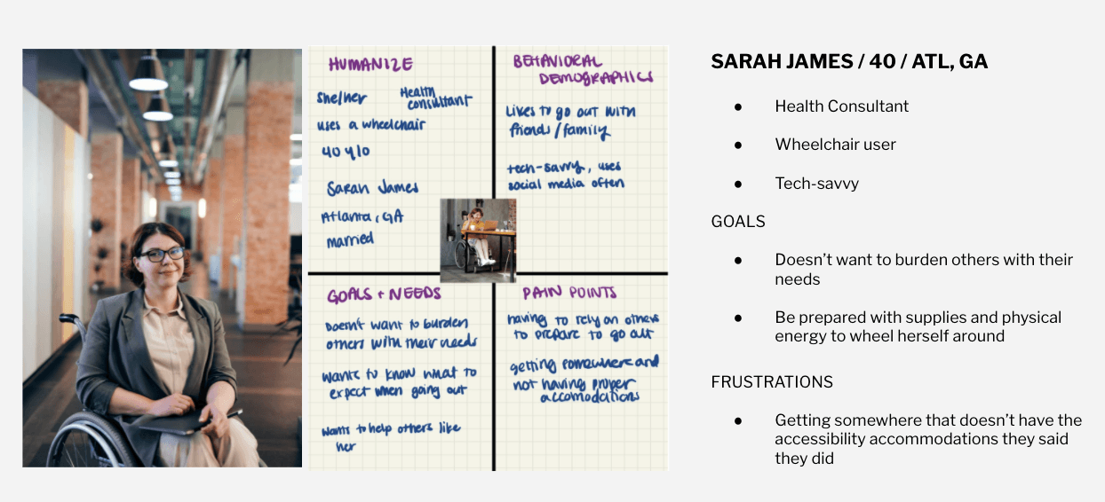
Proto Persona: Meet Sarah James
Phase 2: User Insights
Thought process and habits
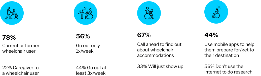
Where users most likely go out to

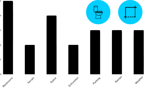
Amenities most important to users
Phase 3: Ideation
User Persona: Meet Courtney Gryffin

COURTNEY GRYFFIN / 36 / ATLANTA, GEORGIA
- Organizational Psychologist
- Married
- Wheelchair User
GOALS
- Self-sufficiency
- Feeling confident and prepared when going out
- Feeling boundless and without anxiety
CONCERNS
I don’t want to make a scene, it’s embarrassing.
Will the restaurant pick up my call? Will the hostess know what accessibility features I’m referring to?
Is their elevator working or a ramp to the entrance? Is there enough space for me in the restroom or between the aisles for me to get through?
Is the table too low/too high for my reach on the wheelchair?
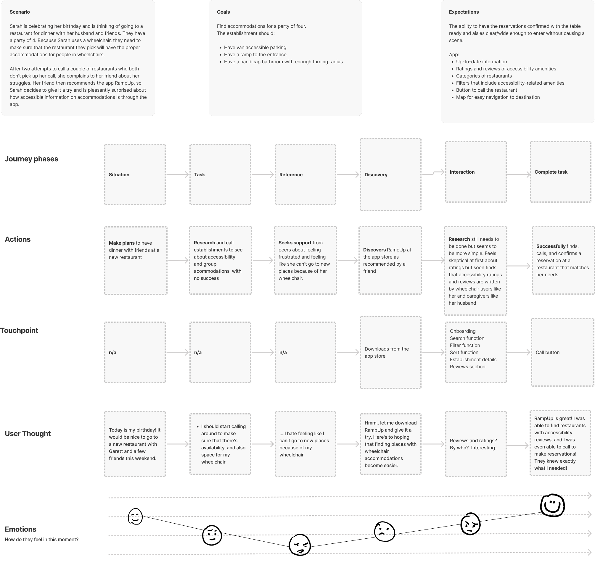
Journey Map
I put myself in Courtney's shoes and thought about every point in her journey to understand her needs, concerns, and desires to identify opportunities for every moment.
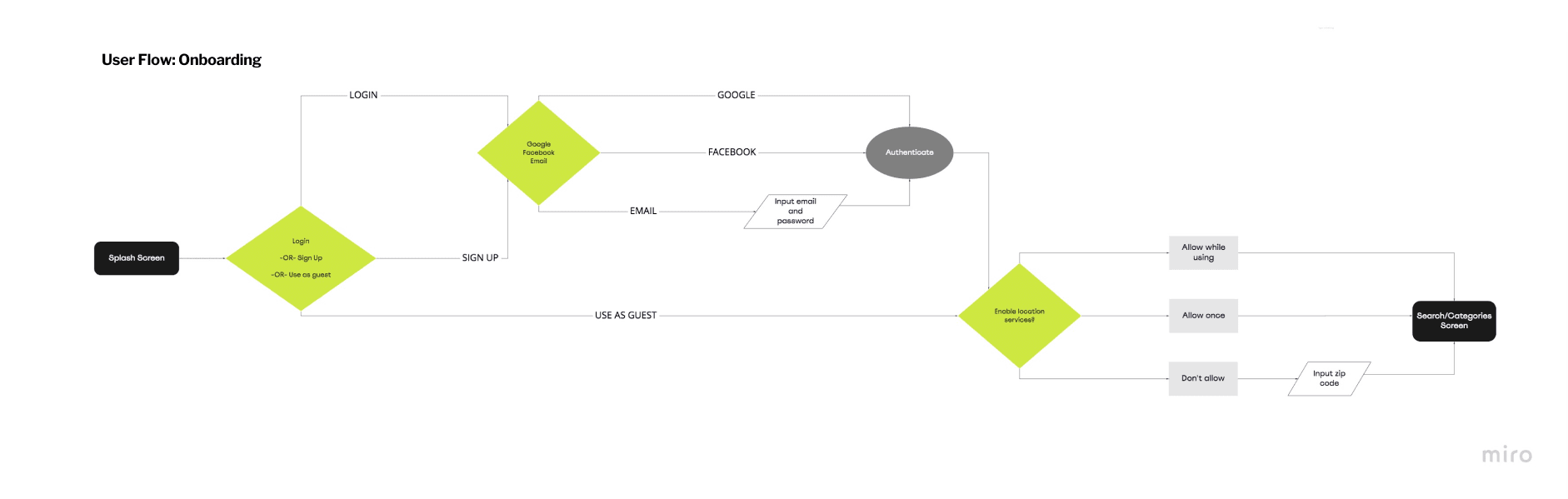
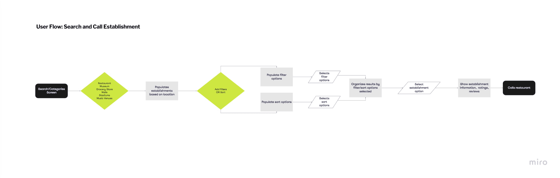
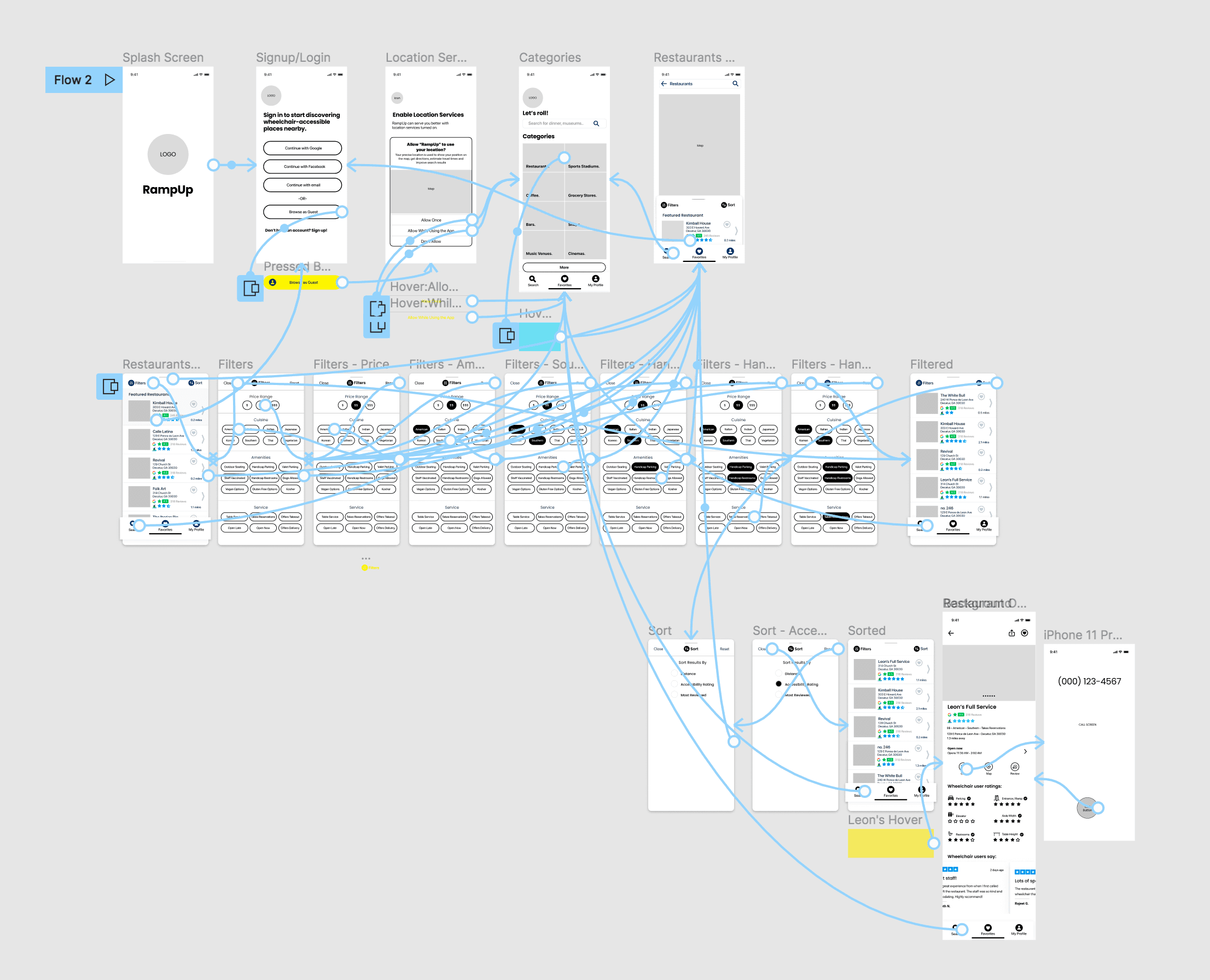
User Flow
I listed out each step and mapped them out as a flow to break down what it would take for the user to achieve specific tasks.
Phase 4: Prototyping
Sketches
As a group, we each sketched our own screens to get a more intimate idea on what the layouts and elements will look like before going digital. We reviewed our sketches altogether and curated the best representation of our flow and features from the collection.
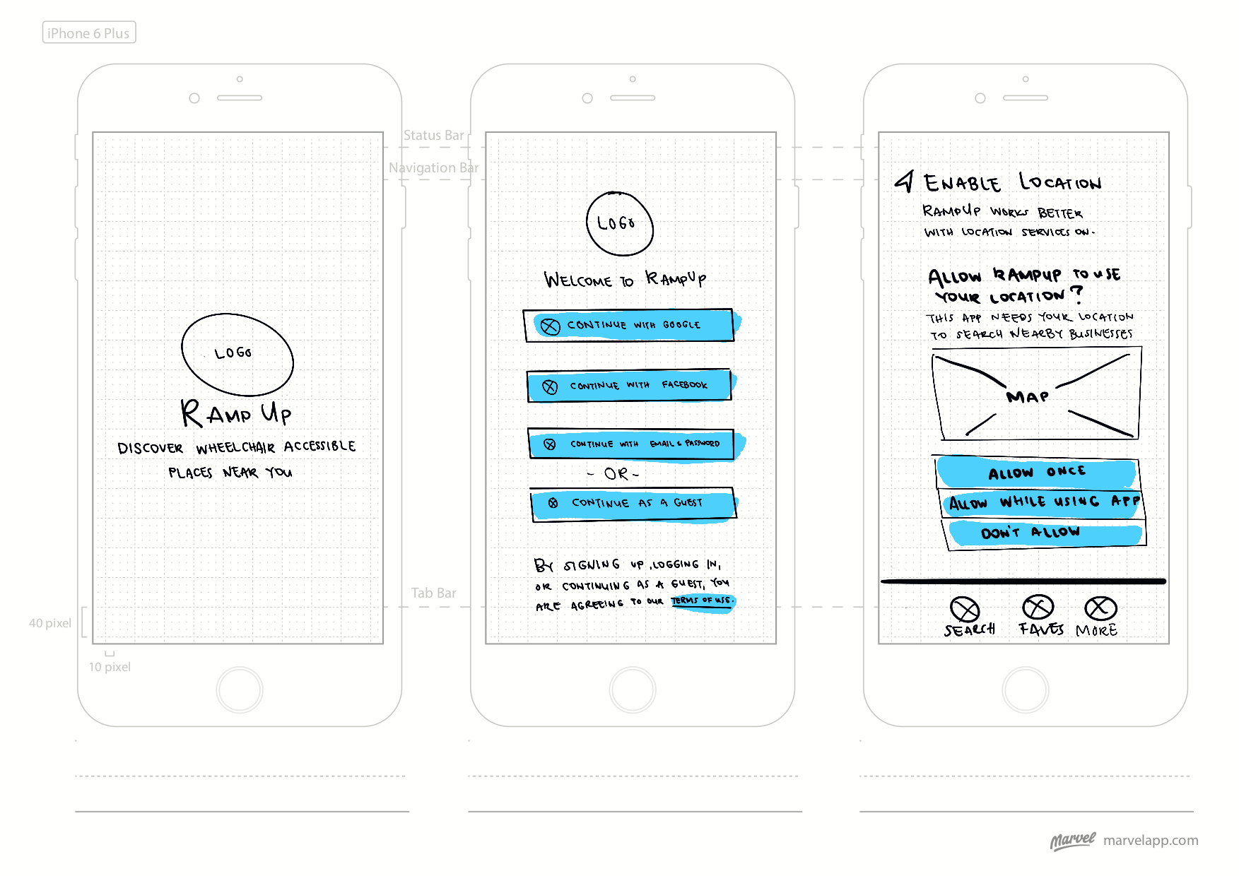
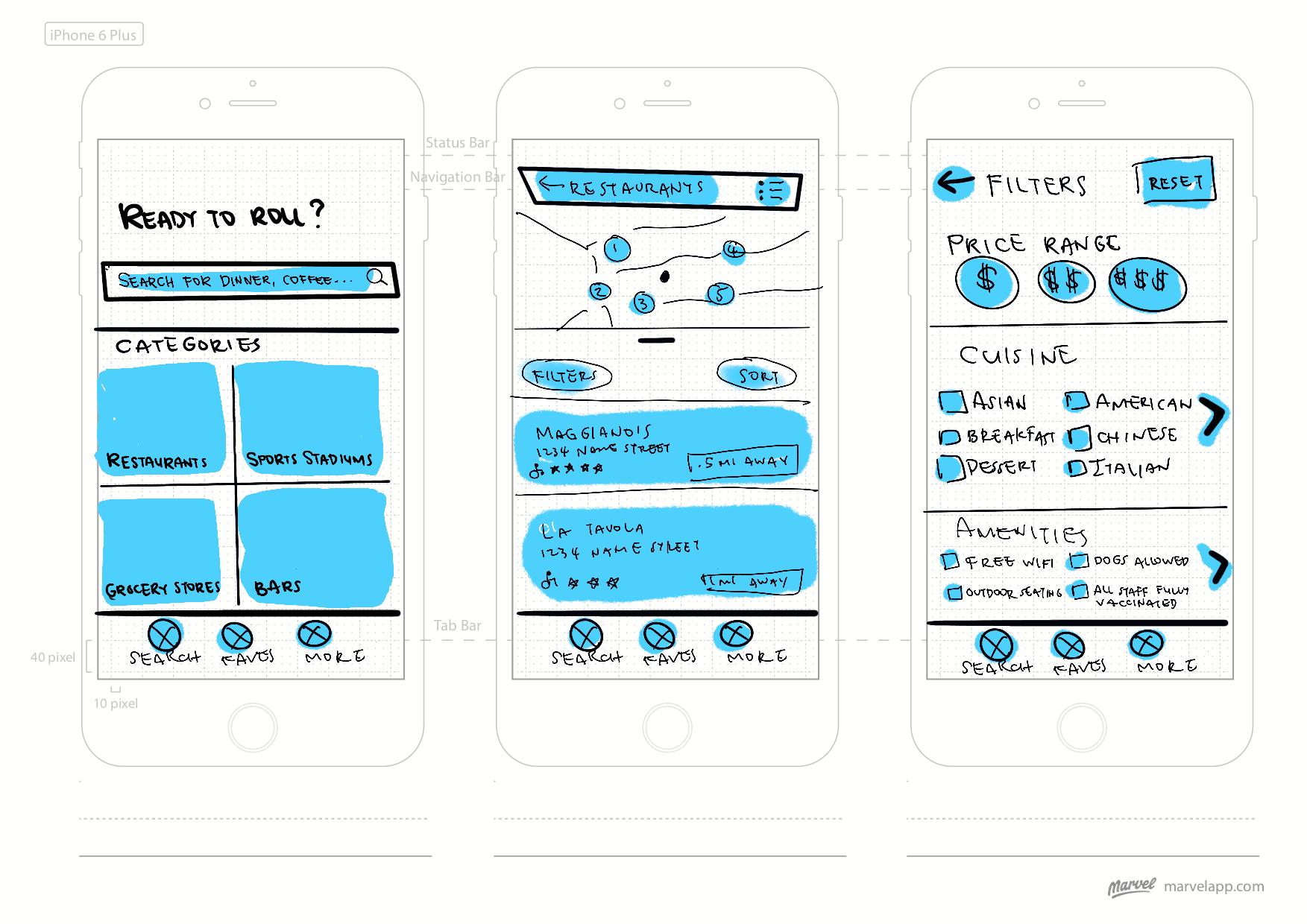
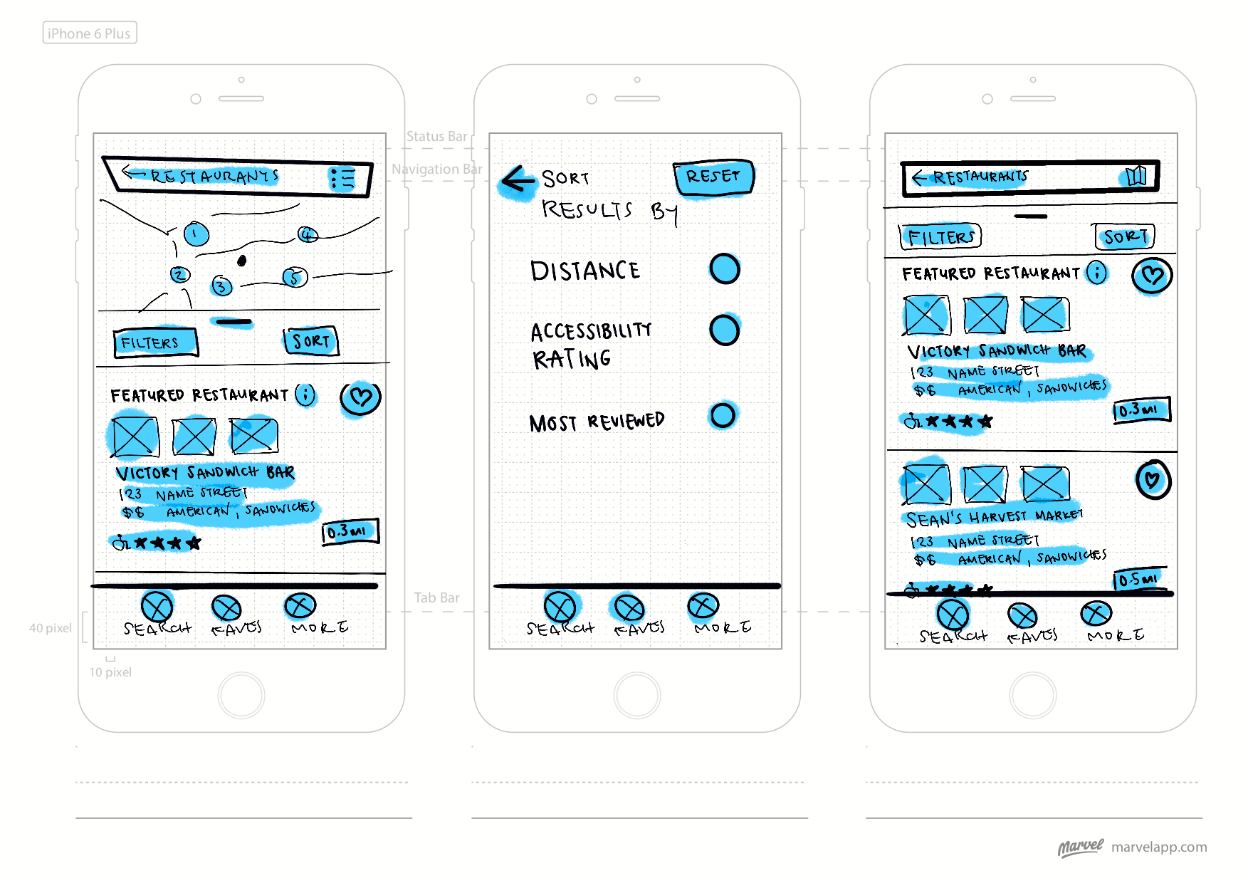
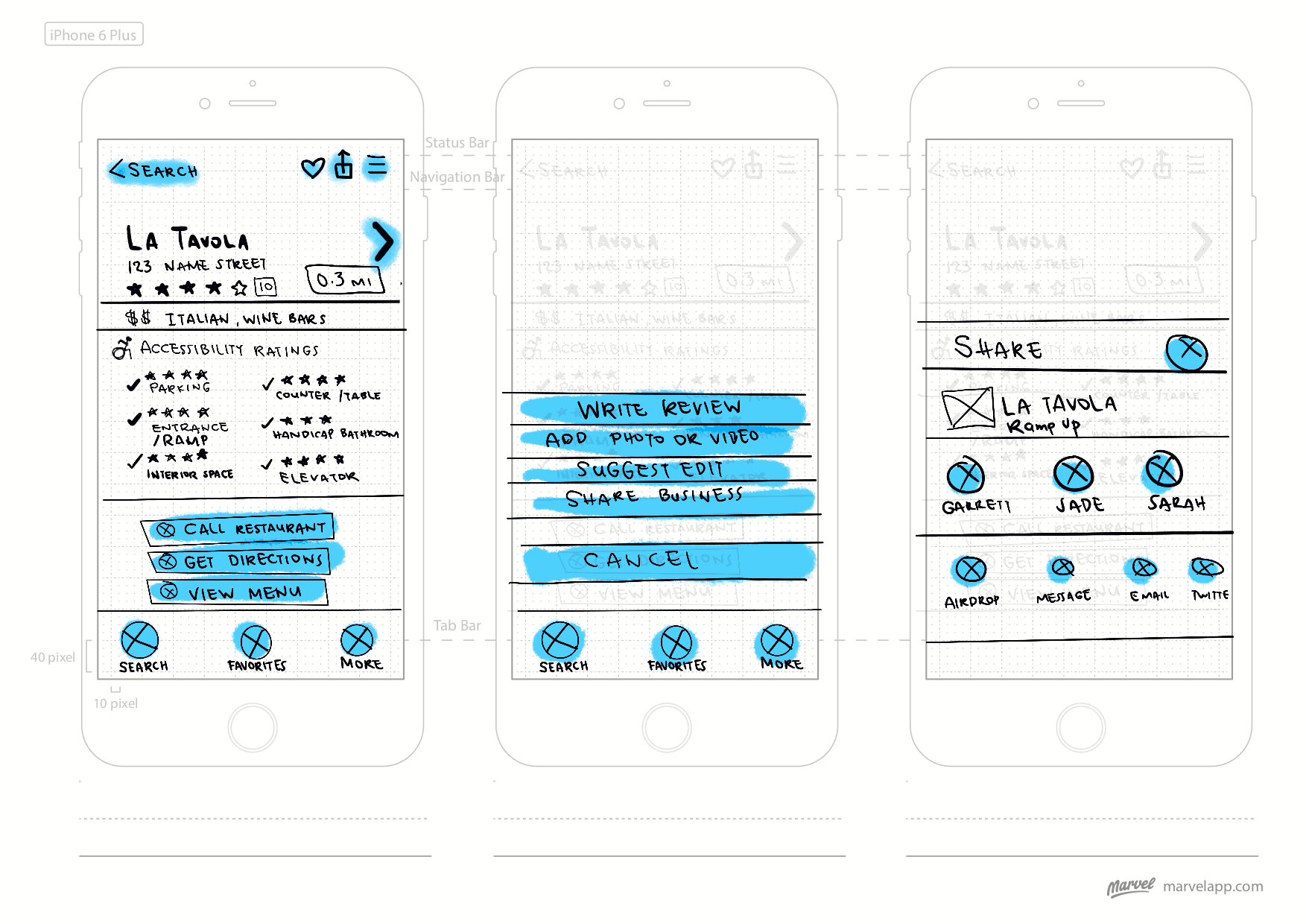
Wireflows
Creating detailed wireframes and interaction flows helped make navigating between screens specific to the user tasks straightforward.
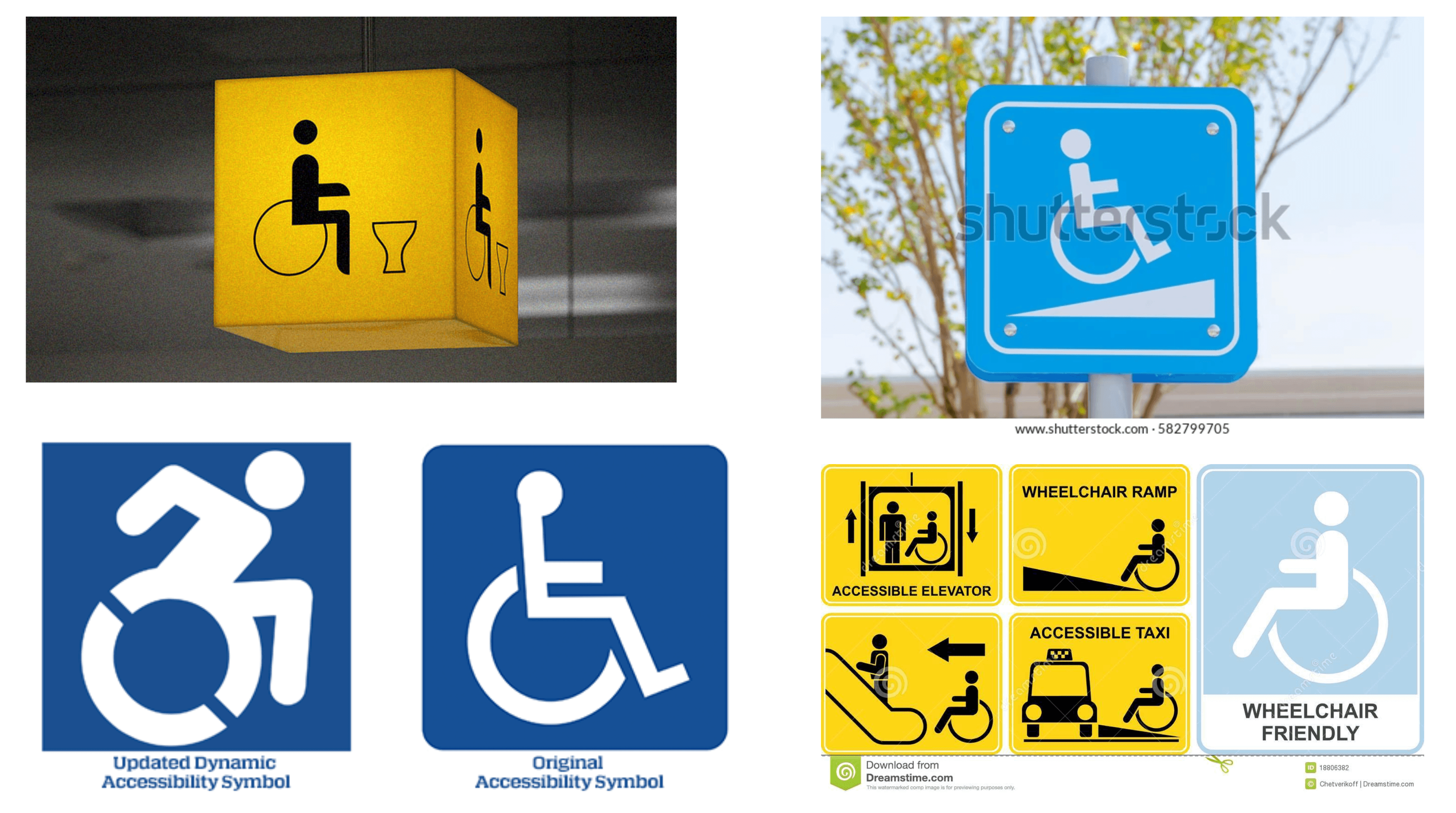
Moodboard
I took inspiration from visual accessibility signs seen around the world.
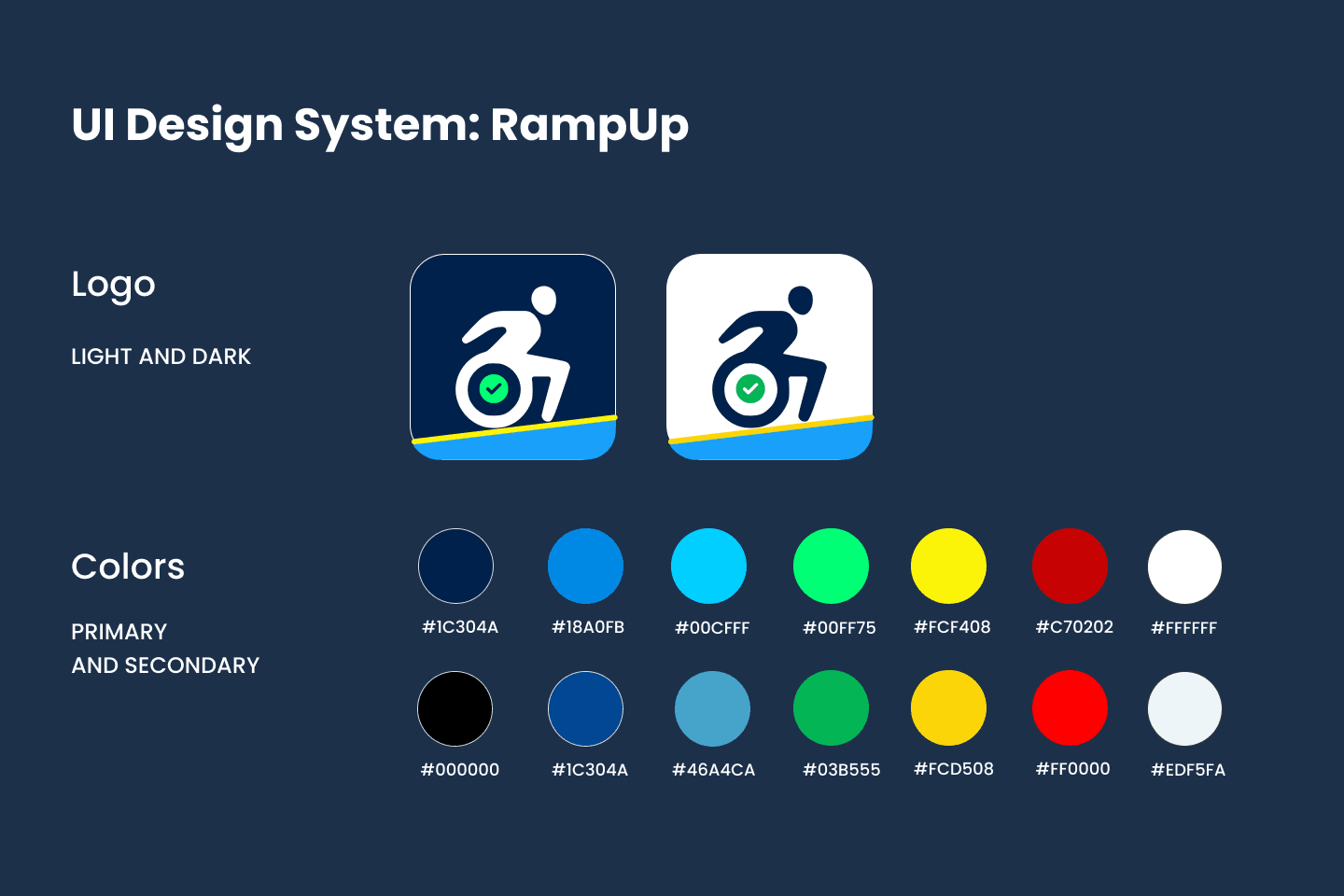
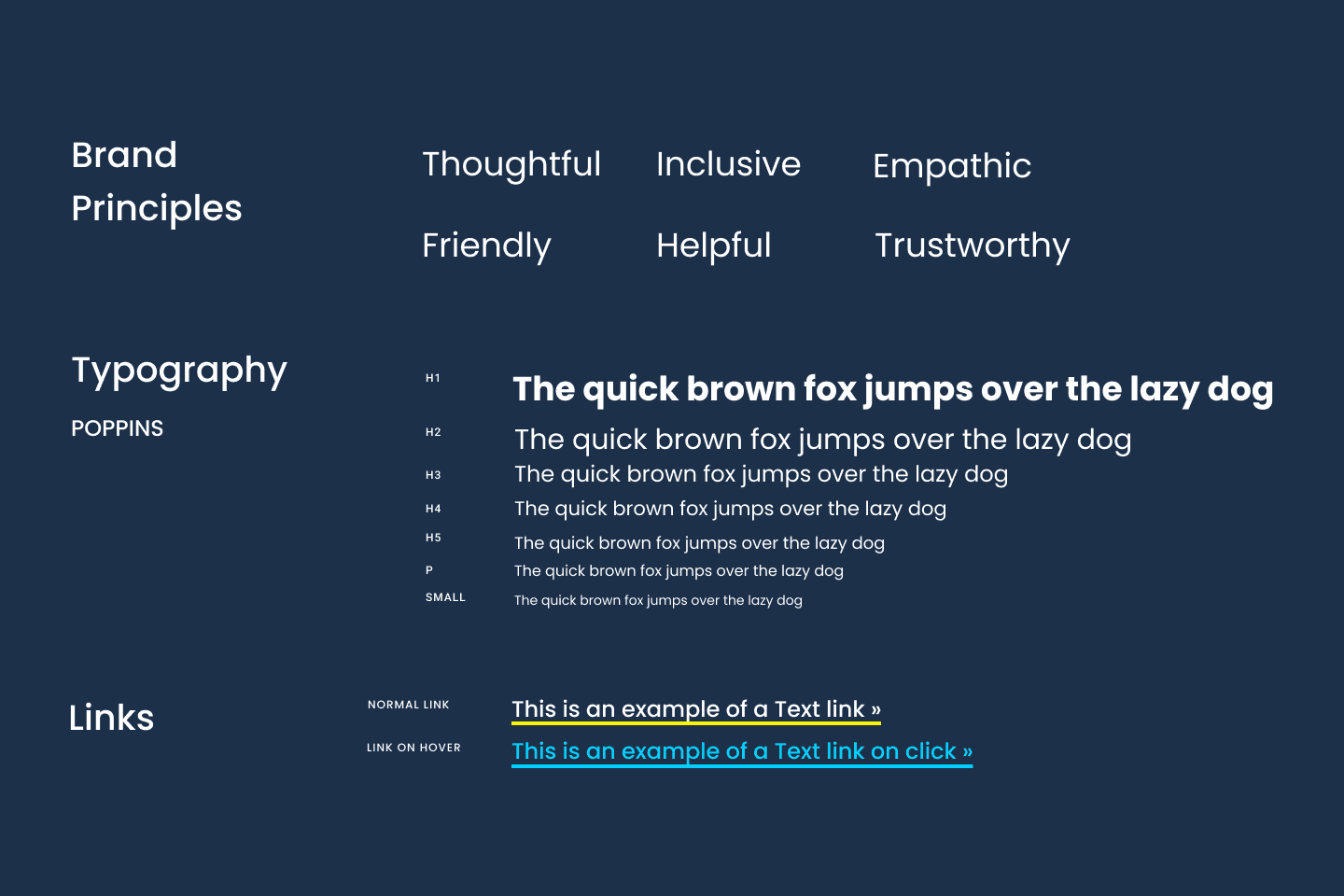
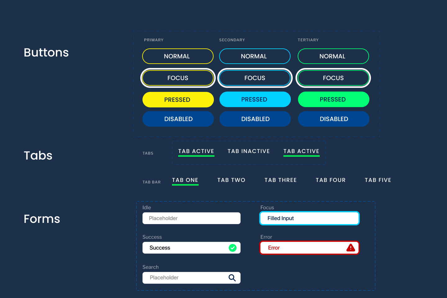
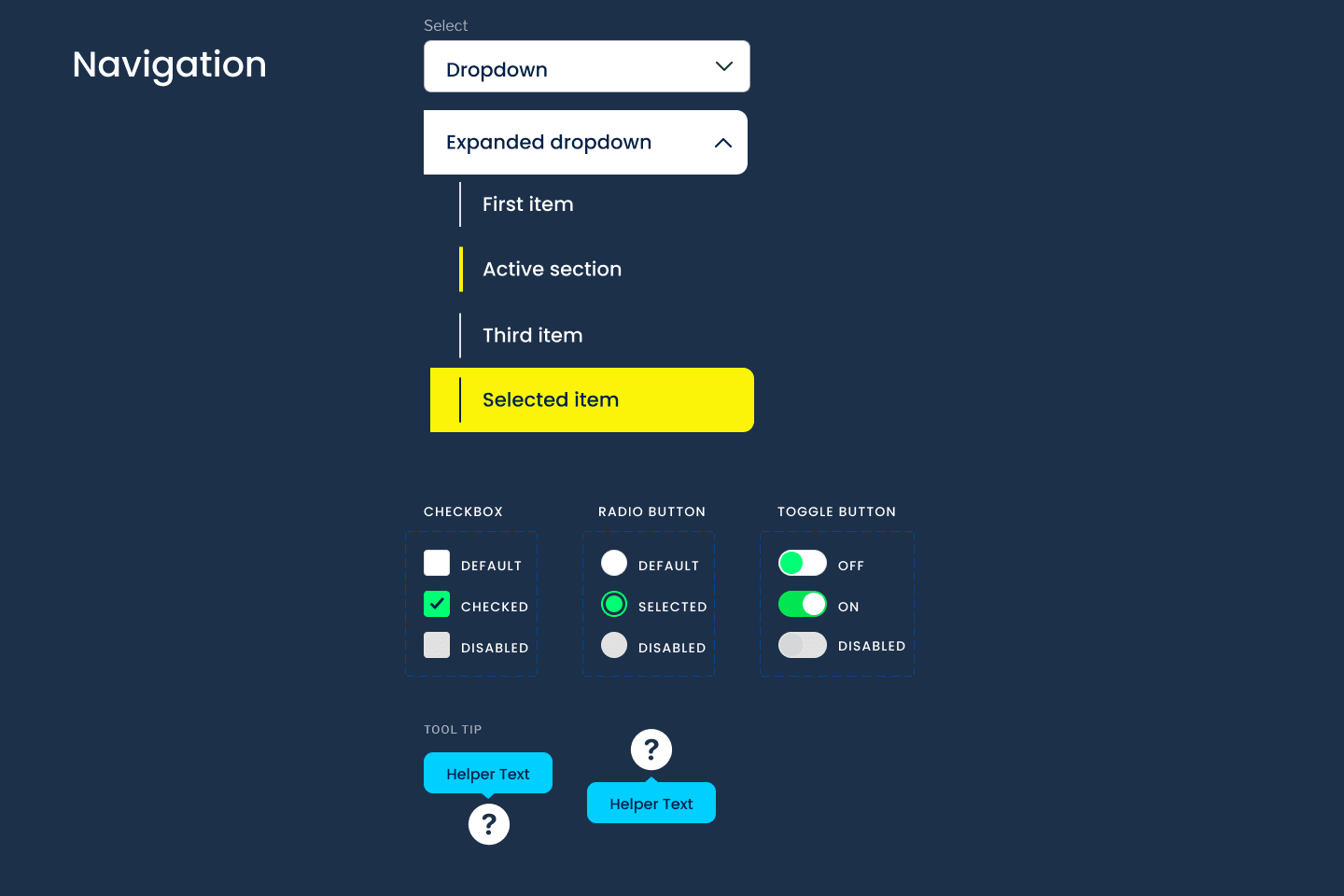
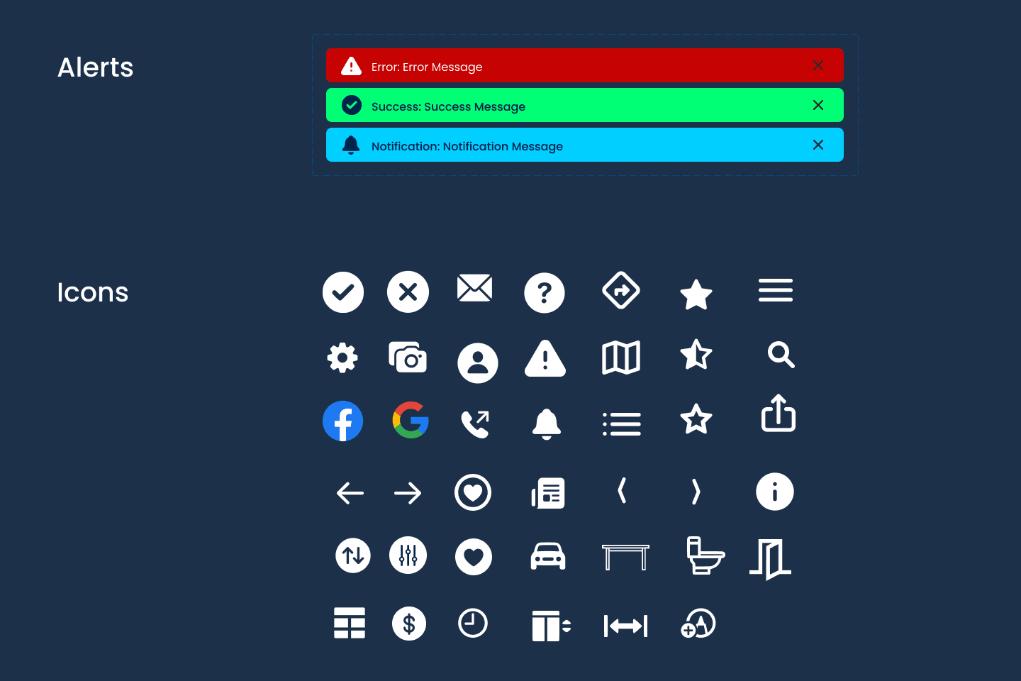
Design System
Because low vision is often a co-morbidity that wheelchair users experience, it was important that the interface is high-contrast and Web Content Accessibility Guidelines (WCAG) compliant overall.
Final Visual Design
The high-contrast design with large fonts and familiar elements were based on my learnings from the visual needs of our users.
Phase 5: Hi-Fi Prototyping + Testing
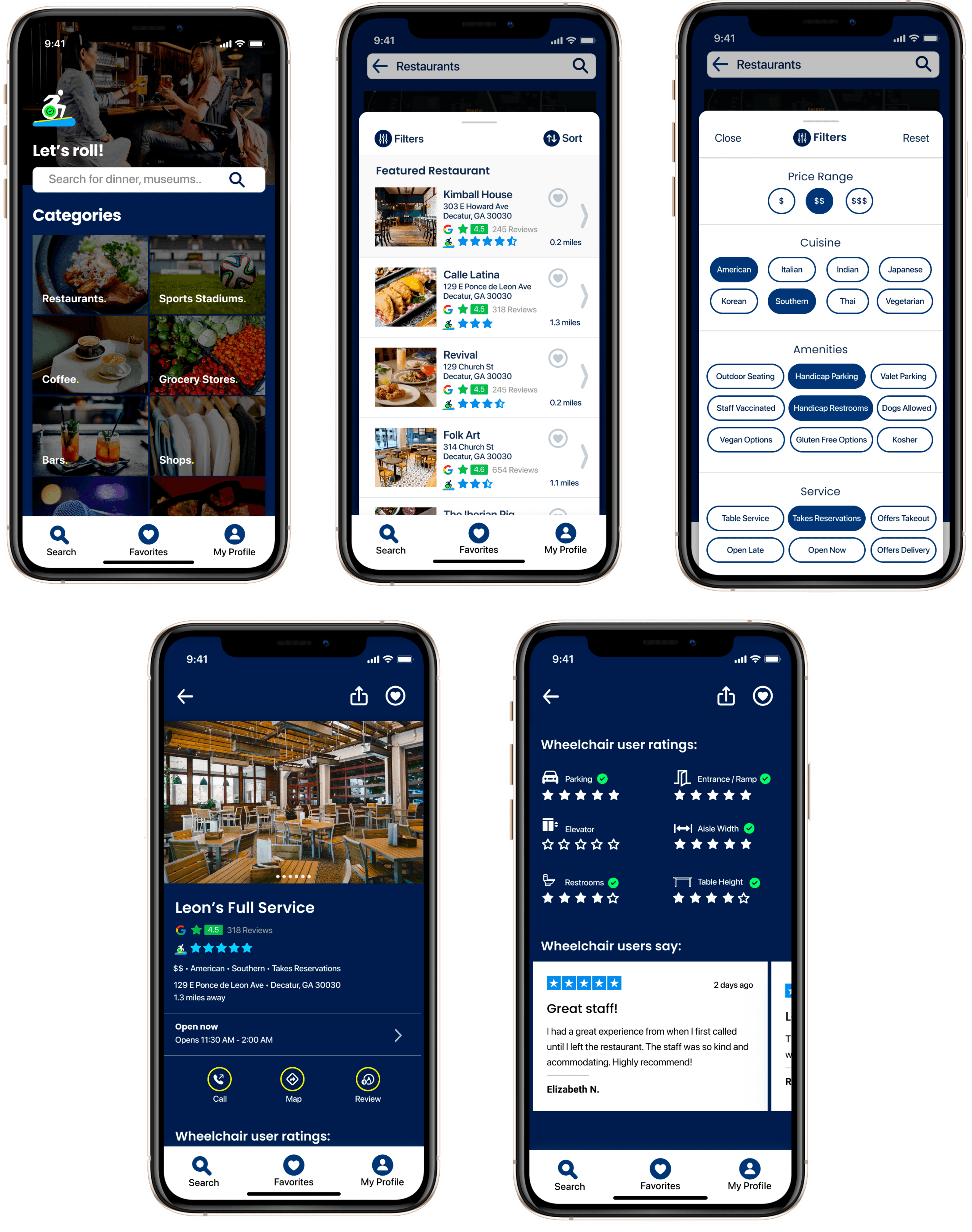
Hi-Fi Prototype

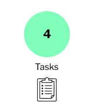
Tasks
- Find the option that lets you browse without signing up
- Select the category that lets you look at places to eat
- Tap where it lets you see the restaurants in a list view
- Filter the restaurants
- Sort the restaurants
- Call top-ranking restaurant
Method
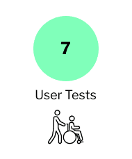
Seven individual user tests (six female, one male) were conducted over Zoom using a testing plan with outlined tasks based on the user flow.
Participants were asked to share their screen while navigating the high fidelity prototype.
Results
All participants were able to accomplish all tasks with little-to-no issues, but did provide feedback on the flow of the app:
- Prioritize accessibility review visuals above Google reviews
- Put call-to-actions to save filter selection choices (i.e. “Save Filters” instead of “Close”)
- Change verbiage to make things more clear (i.e. “Amenities” instead of “Wheelchair User Ratings”)
User Anecdotes
This would make life so much easier when it comes to finding places for our clients. I can target what I want and I can get the information immediately.
– Caregiver, 58
It would be nice if I could create a profile with my specific needs. It would be helpful if the app sent pre-programmed messages to the restaurant, because I often have to copy and paste my requirements and sometimes I forget things.
– Caregiver, 57
I really like that you included table heights and aisle width. I think that's an important thing that goes unnoticed.
– Caregiver, 32
Retrospect + Conclusion
Collaboration
- Team dynamics worked well: open minds, challenged assumptions
Empathy
- We as a team truly were not the users of this product, so there was very little room for assumptions that we can justify on our own
- Patience and understanding for the world beyond ourselves
- Real social responsibility; can’t make egregious generalizations
- Empathic to different human conditions
Research
- Finding people to interview and test with that fit our persona was very difficult
- Reach out earlier, connect with a network, a lot more research and cold-calling (time constraint was the biggest challenge)
- This can be a sensitive topic – wheelchair users never want to make a scene about their needs and don’t want to be perceived “as a burden”
Future Opportunities
If I could develop this app further, I would:
- Conduct more user tests with people and more iterations
- Gathering more research/information to populate the app
- Create profile with accessibility specifications
- Send reservation requests to establishments directly through the application with accessibility accommodation specs
- Incentivize businesses to list and update accessibility features
Thanks for reading!
Interested in working with me?
More Case Studies

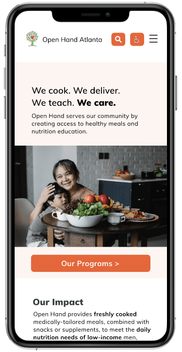
Open Hand
Nonprofit Website UX/UI Re-design
A nonprofit helping low-income seniors, caregivers, and people with chronic illnesses receive food assistance.
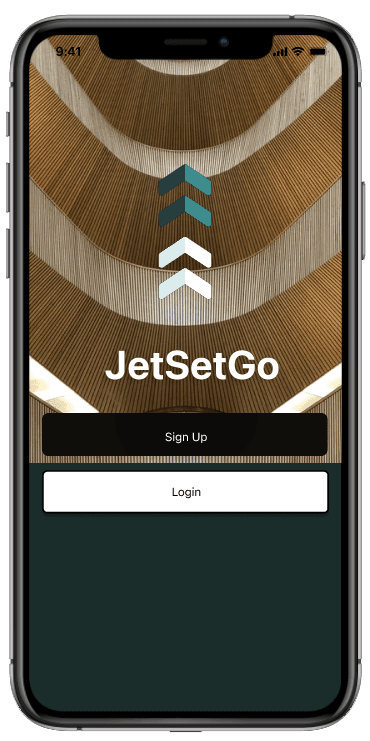
JetSetGo
Mobile App UX/UI Design
A travel planning app that offers overwhelmed travelers a streamlined way to create and collaborate on itineraries with friends.