Open Hand Atlanta
Nonprofit Responsive Website Re-design
Re-designed to make it easier for low-income seniors, caregivers, and people with chronic illnesses receive food assistance.
Roles: Project Manager, UX Researcher, UI Designer, Usability Tester
Timeline
3-week Group Project
Key Skills
User Interviews, Data Synthesis, Sketching, Information Architecture, Workflows, Wireframing, Interface Design
Tools
Google Forms, Miro, Descript, Figma, and teamwork.
Context
Open Hand Atlanta (OHA) is a nonprofit organization that seeks to eliminate disability and untimely death due to nutrition-sensitive chronic disease.
Powered by donors, volunteers, and partners, OHA offers meal programs for:
- Seniors in need of nutrition assistance
- Medicaid beneficiaries
- People with HIV/AIDS diagnosis
- Caregivers of individuals with the above qualifications
Overview
Problem
Low-income, hardworking caregivers strive to provide nutritious meals made with fresh ingredients for their family, but struggle to make time or have the means for grocery shopping because they work long hours with very little pay.
This makes them feel bad about themselves, and the lack of nutritious food exacerbates the family's existing health issues.
While there are meal programs they qualify for, information about how to qualify and the process for qualifications are often hard to find, which discourages them from seeking help.
Goal
On the OHA website, how might we make the information gathering process more efficient for potential beneficiaries?
Solution
By re-designing the website to highlight their programs and make potential beneficiary information easier to find, the organization can better serve the community and extend their reach within Atlanta.
UX: Streamlined the user flow within the website for a smooth and productive user experience.
UI: Prioritized accessibility in the graphic elements of the website re-design to better serve the users.
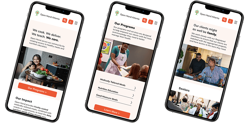
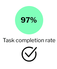
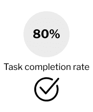
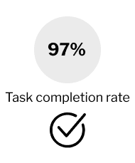
Mobile Prototype Results
User-Centered Design Process

User Research

Ideation

Prototyping
Usability Testing + Iteration
Phase 1: Discovery + Proto Persona
Website End Users
After skimming the website, we assumed that these are the main user types of openhandatlanta.org.
However, due to the time and scope constraints, the later stages of the project focused primarily on the prospective beneficiaries.
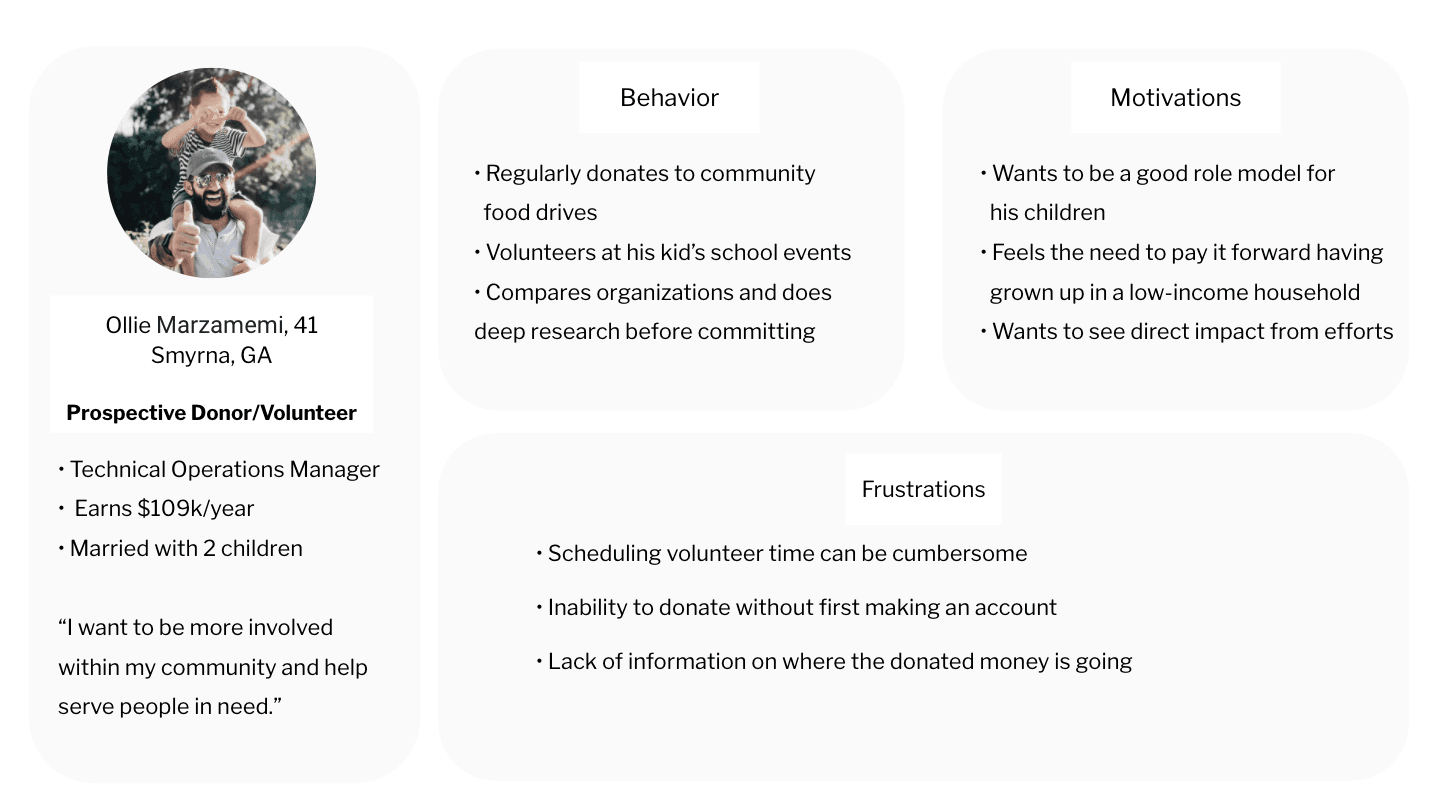
Donors/Volunteers
Users who visit the website to find out more about how they can support OHA initiatives
Prospective Beneficiaries
Users who visit the website to find out more about OHA programs and qualifications
Proto Personas

The Stakeholder
Unfortunately, we did not get to speak with a stakeholder even after a few follow-ups.
The following are some questions we hoped to get answers for.
Due to the timeline of the class project, we proceeded with doing our own heuristic evaluation to assess usability issues for the beneficiary.
User Insights
Please describe your average:
- Beneficiary
- Volunteer
- Donor
What issues have you heard about the website from:
- Beneficiaries
- Volunteers
- Donors
Business Goals
• What are OHA's business goals for the next two quarters?
• What issues are you hoping a new website design will address?
• What is the most critical goal of this deliverable?
Heuristic Evaluation
Based on Gerhardt-Powals' Cognitive Engineering Principles

Key Findings
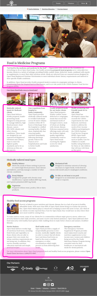
• Unwanted Workload: Company mission and purpose are up to interpretation on the home page
• Cognitive Overload: Content on page is not easily scannable
• Poor Visibility: Call-to-action signifiers are not immediately visible or distinguishable
• Lack of Accommodation: The interface lacks accessibility compliance with low contrast design choices. Search box is nonexistent.
Research Goals
• Understand how users navigate the current site to gather information on qualifications
• Understand OHA company impressions on users
• Identify extraneous content within the website in order to make the process more efficient
User Tasks
• 5-second test
• Find the page that describes OHA's mission statement
• Find the page that lets you see if you qualify to receive assistance from OHA.
User Research Conducted
Six total participants via Zoom interviews
User Insights
Pain Points
• Overwhelm from amount of content to read
• Guesswork on what to click
• Taxing to look for specific information
Suspected Causes
• Too much unnecessary content on pages
• Calls-to-action lack visual emphasis
• Poor use of color and graphics causing the user to spend a lot of time assimilating raw data
Standout Interview Quotes
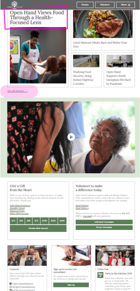
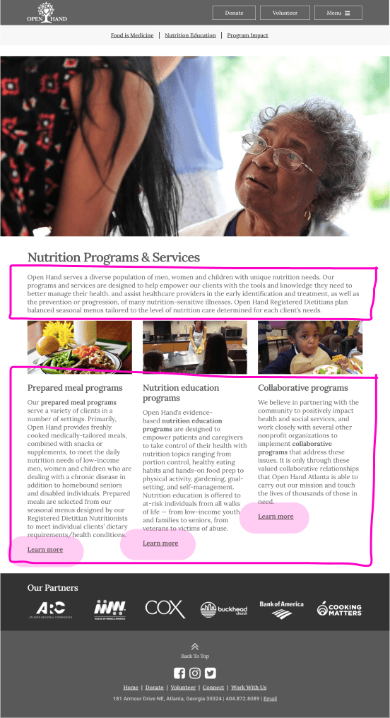
There's too many words on here. This could be a barrier to them getting help because the actions are difficult to find.
– Irene
There's just so much information to sift through that it gets overwhelming, and it all looks the same. I wouldn't remember what page I was on because they look identical with color and font and everything.
– Raquel
The options I was looking for aren't visible enough. I think the links can be more visible, like what if the person is color blind?
– Veronica
Affinity Diagram Insights
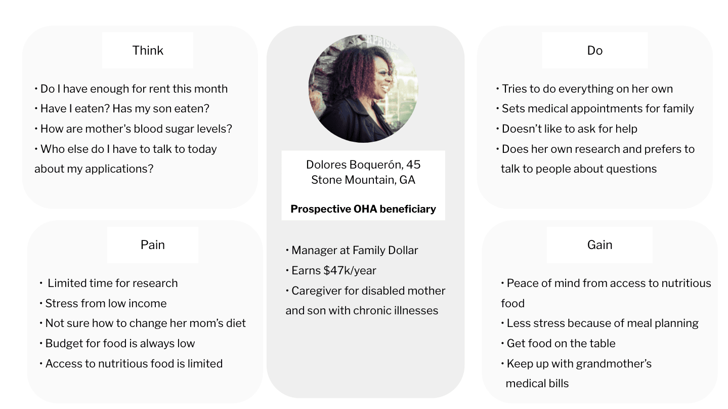
Accessibility
• Dolores needs to access the website and find information quickly because she has limited and inconsistent internet access
Resources
• Dolores needs to get an understanding of the qualification process to gain access to nutritious food
Food Education
• Dolores seeks a support system to help her family live healthier lives
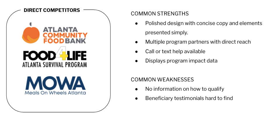
Competitive Analysis
Empathy Map: Meet Dolores Boquerón
UX Scenario
Scenario
• Searches for local organizations providing low-income food assistance
• Finds Open Hand Atlanta
Goal
• Gather information on the food assistance programs
• Find forms/documents to complete for qualifications
• Speak to an organization representative for more information
Risks + Emotions
• Limited time for research
• Skeptical from experience of government assistance holdups
• Stressed by impending health issues caused by lack of nutritious food for family
Phase 3: Ideation
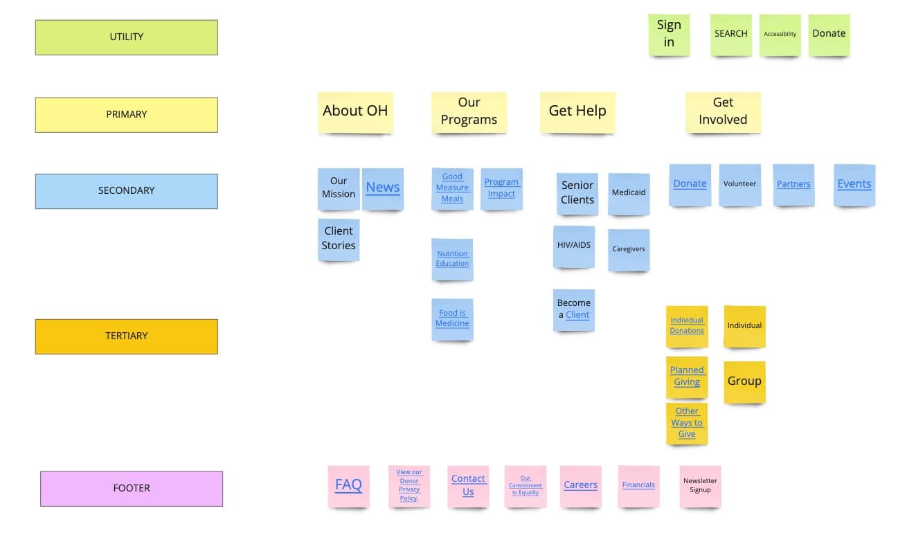
Card Sorting
There was no site map on openhandatlanta.org, so we created the site map based on:
• The typical user path from our tests
• Pages that were visible across the site
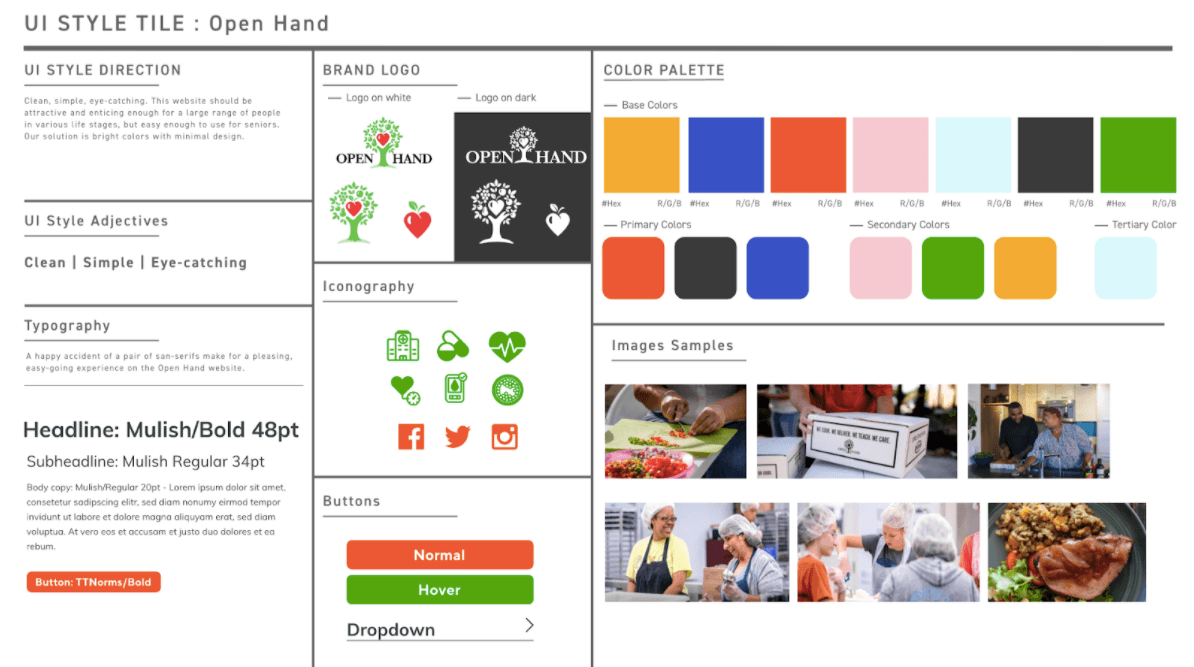
UI Style Guide
It is important to the user that the site design is clean, simple, and high contrast. We intended for the design to be attractive and useful for people across life stages, but easy enough to use for seniors.
Phase 4: Prototyping
Mid-Fi Prototype
Hi-Fi Prototype
Phase 5: Usability Testing
Objectives
• Is it easy for the user to understand what Open Hand Atlanta is?
• Can the user find information on how to qualify?
User Tasks
• Five-second test
• Find information on their programs
• From where you are, find the page that lets you see if you qualify to receive assistance from Open Hand
• From where you are, find the option that lets you take the first step towards qualifying
User Research Conducted
Five individual interviews were conducted over Zoom using a script with targeted questions to meet the research objectives.
Results
Feedback:
- Top toolbar: change to a different color (background) for better contrast
- Get Help Page: copy doesn’t match the CTA
User Anecdotes
The one page aspect [jump-to-section] is nice. The choice of colors and consistent use of font makes for a clean interface – simple and easy to understand.
– Pete
I like the infographics/statistics, it's a quick read. Client stories are also cool to see.
– Adina
It's pretty easy to scan!
– Candace
Retrospect + Conclusion
Collaboration in the team and stakeholders
- The team collaboration wasn't off to a great start, but got better towards the end which made the decision-making process for the project easier
- We never heard back from the stakeholders, but this encouraged us to do deep research on our own and challenged us to prioritize what we wanted to focus on based on user research
Future Opportunities
If I could develop this website further, I would:
- Build a questionnaire for the potential beneficiary that helps direct them to the next steps, which will reduce scrolling and scanning for information
- Reduce the content on the pages even more, and do more testing
Thanks for reading!
Interested in working with me?
More Case Studies

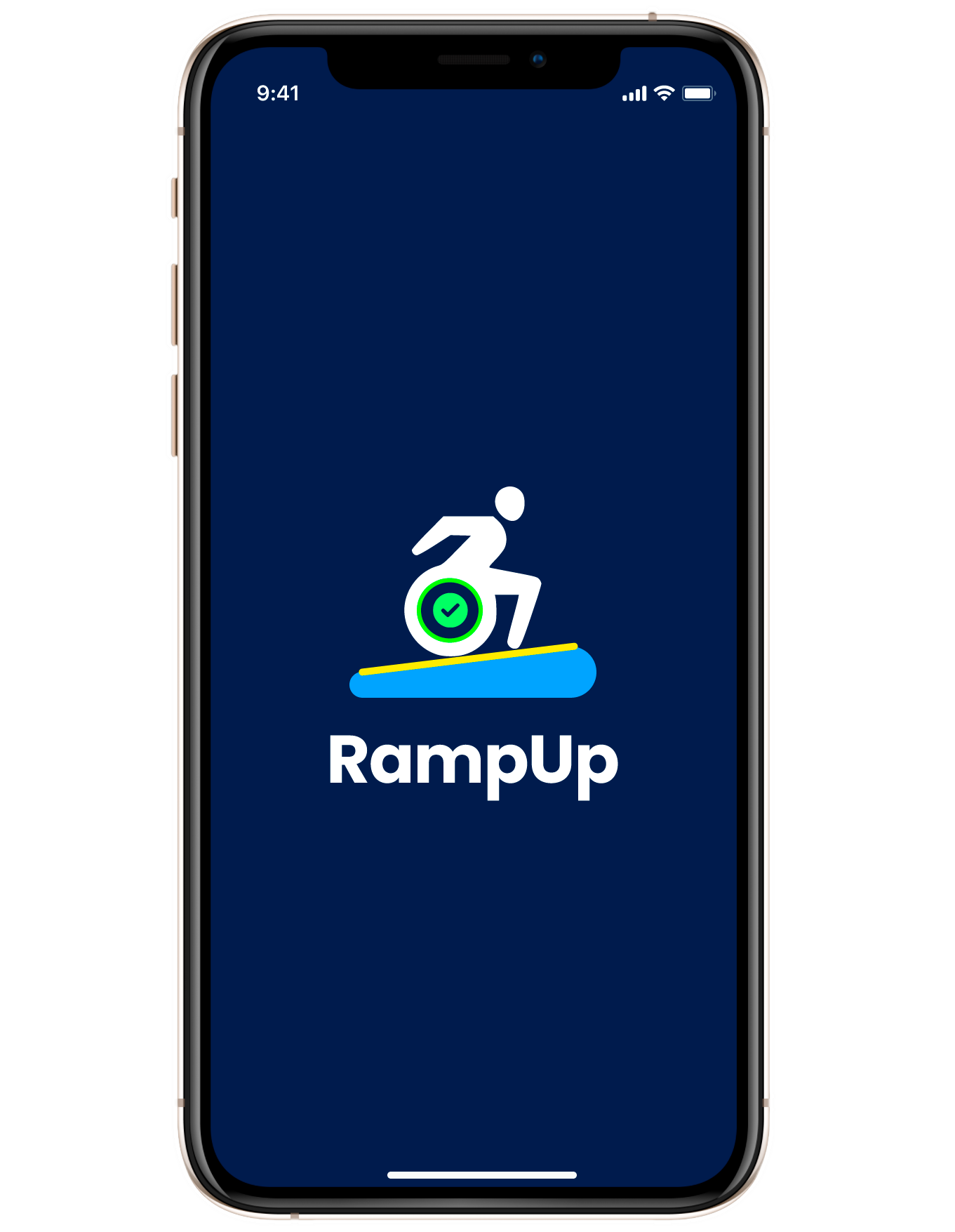
RampUp
A mobile app that lets wheelchair users and caregivers discover authentically accessible places near them.

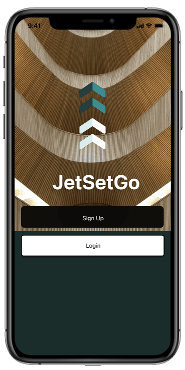
JetSetGo
A travel planning app that offers overwhelmed travelers a streamlined way to create and collaborate on itineraries with friends.